之前看到一些微信公众号里有点击图片,让图片逐渐变亮的功能,自己就想尝试一下。
<!-- 加载CSS代码 -->
<style>
  /* 定义初始状态的图片样式 */
  #my-image {
    filter: brightness(0.5);
    transition: filter 1s;
  }

  /* 定义点击时的图片样式 */
  #my-image.clicked {
    filter: brightness(1);
  }
</style>

<!-- 加载HTML代码 -->
<div>
  <img id="my-image" src="http://up.deskcity.org/pic_source/2f/f4/42/2ff442798331f6cc6005098766304e39.jpg" width="100%" onclick="this.classList.add('clicked')">
</div>
效果如下:
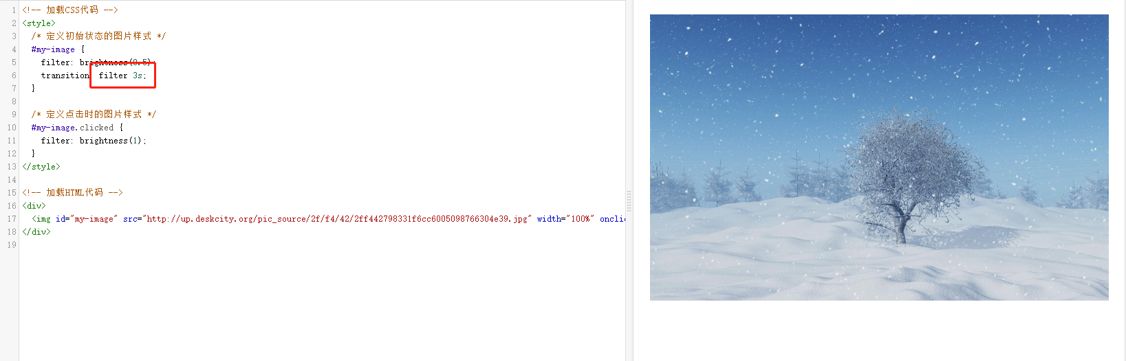
点击按钮后,图片在3秒内逐渐变亮。
这个是从某编辑器上看到的代码,实现了两张图片,渐变切换:
<section style="display: inline-block;width: 100%;vertical-align: top;overflow: hidden;align-self: flex-start;letter-spacing: 0.034em;max-width: 100% !important;box-sizing:border-box;font-family: -apple-system-font, BlinkMacSystemFont, "Helvetica Neue", "PingFang SC", "Hiragino Sans GB", "Microsoft YaHei UI", "Microsoft YaHei", Arial, sans-serif;" class="_135editor"> <section style="height: 0px;overflow: visible;box-sizing: border-box;"> <section style="display: inline-block;width: 100%;vertical-align: top;max-width: 100% !important;box-sizing:border-box;"> <section> <svg viewbox="0 0 1 1" style="float:left;line-height:0;width:0;vertical-align:top;box-sizing:border-box;" xml:space="default"></svg> </section> </section> </section> <section style="height: 0px;overflow: visible;box-sizing: border-box;"> <section style="width: 100%;vertical-align: top;height: auto;max-width: 100% !important;box-sizing:border-box;"> <section style="height: 0px;box-sizing: border-box;"> <svg width="100.00%" xmlns="http://www.w3.org/2000/svg" style=";width: 100%;max-width: 100% !important;box-sizing:border-box;transform: rotateZ(0deg);-webkit-transform: rotateZ(0deg);-moz-transform: rotateZ(0deg);-o-transform: rotateZ(0deg);" viewbox="0 0 1080 720" xml:space="default"> <svg width="100%" height="100%" style="box-sizing: border-box;" data-height="100%" xml:space="default"> <svg width="100%" height="100%" style="box-sizing: border-box;" data-height="100%" xml:space="default"> <rect fill="rgb(254, 254, 254)" width="100%" height="100%" style="box-sizing: border-box;" x="0%" y="0%"></rect> </svg> <svg style="box-sizing: border-box;" xml:space="default"> <foreignobject width="100%" height="100%" x="0" y="0" style="box-sizing: border-box;"> <svg space="default" style="width: 100%;background-position: 50% 50%;background-repeat: no-repeat;background-size: cover;background-attachment: scroll;-webkit-tap-highlight-color: transparent;visibility: visible;pointer-events: none;background-image: url("https://mmbiz.qpic.cn/mmbiz_jpg/VgFx8ZHwKGp7AZeatdWh7Via33kxhgcibx3VQfzEMUz2H8iaBKHfsC4Q89svjRY965wpWh1h1vpmsTBiaI01Wkrklg/640?wx_fmt=jpeg");user-select: none;max-width: 100% !important;box-sizing:border-box;" viewbox="0 0 1080 720" xlink="http://www.w3.org/1999/xlink" xml="" xmlns="http://www.w3.org/2000/svg" xml:space="default"></svg> </foreignobject> </svg> </svg> </svg> </section> <section style="height: 0px;box-sizing: border-box;" class=""> <svg width="100.00%" xmlns="http://www.w3.org/2000/svg" style=";width: 100%;max-width: 100% !important;box-sizing:border-box;transform: rotateZ(0deg);-webkit-transform: rotateZ(0deg);-moz-transform: rotateZ(0deg);-o-transform: rotateZ(0deg);" opacity="1" viewbox="0 0 1080 720" xml:space="default"> <svg width="100%" height="100%" style="box-sizing: border-box;" data-height="100%" xml:space="default"> <svg width="100%" height="100%" style="box-sizing: border-box;" data-height="100%" xml:space="default"> <rect fill="rgb(254, 254, 254)" width="100%" height="100%" style="box-sizing: border-box;" x="0%" y="0%"></rect> </svg> <svg style="box-sizing: border-box;" xml:space="default"> <foreignobject width="100%" height="100%" x="0" y="0" style="box-sizing: border-box;"> <svg space="default" style="width: 100%;background-position: 50% 50%;background-repeat: no-repeat;background-size: cover;background-attachment: scroll;-webkit-tap-highlight-color: transparent;visibility: visible;pointer-events: none;background-image: url("https://mmbiz.qpic.cn/mmbiz_jpg/VgFx8ZHwKGp7AZeatdWh7Via33kxhgcibxicAMANWVG8bIt3Kjd7pib0FBv0rMI8pWwImXQEH3yG2T9Wr5fZ6ZeSjg/640?wx_fmt=jpeg");user-select: none;max-width: 100% !important;box-sizing:border-box;" viewbox="0 0 1080 720" xlink="http://www.w3.org/1999/xlink" xml="" xmlns="http://www.w3.org/2000/svg" xml:space="default"></svg> </foreignobject> </svg> </svg> <animate style="box-sizing: border-box;" fill="freeze" attributename="opacity" begin="click" from="1" to="0" dur="2" restart="never"></animate> <animate style="box-sizing: border-box;" fill="freeze" attributename="width" begin="click + 2s" from="1" to="0" dur="0.01" restart="never"></animate> </svg> </section> </section> </section> <section style="height: 0px;padding-top: 66.6667%;box-sizing: border-box;"> <br/> <section> <svg viewbox="0 0 1 1" style="float:left;line-height:0;width:0;vertical-align:top;box-sizing:border-box;" xml:space="default"></svg> </section> </section> </section>


